Every gotdamn time I see a review of Apple Black (the OEL manga by Odunze “WhytManga” Oguguo), it always goes out of its way to say how good the art is. It doesn’t matter if the review is good or bad. This is the unifying issue across generations and political parties: Whyte Manga sure knows how to draw. You don’t build an entire how-to-draw-manga career on Youtube without knowing how to draw. And everyone cheers and claps in agreement, as if Apple Black is a greater social solvent than a pepsi can at a protest.
Alright I’ll stop lubing you up and just say it. I hate the art in Apple Black. Hate it. And this isn’t just me going out of my way to have a contrarian hipster opinion. It is flat and soulless and ugly.
If we’re going to pretend that art is subjective (it’s not, and my opinion is the only correct one) then fine, I’ll show my hand. Miyazaki Natsujikei is pretty high on my list of “Artists who fuck.” I bought a copy of their manga “There’s nothing wrong with me” - just based on the cool cover alone- and reread it obsessively, before I knew Japanese. It still stands as one of my most reread mangas. Their work is all about the unique design and dreamlike pacing. Cohesiveness and accurate anatomy isn’t a priority in their visual language. It’s all about the atmospheric and experimental vibes.
Here’s some of their tankobon covers so you get a sense for their style:
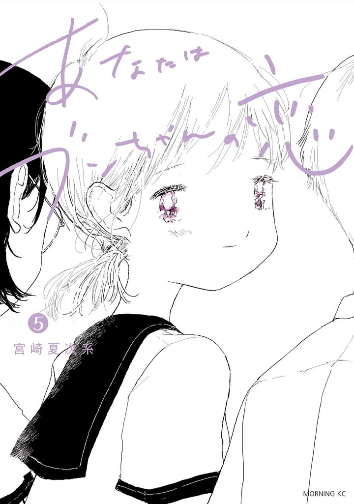
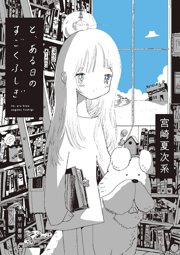


But the real treat is in the pages, so, don’t take these illustration samples as a definitive slice of their artistic strength.
This isn’t to say “you must be this experimental for me to give a shit.” Here’s some mainstream shonen manga, the same genre as Apple Black, that I think are Pretty Good:
Dr. Stone
Chainsaw Man
Matagi Gunner but nobody tell the mangaka I read it scanlated, please, I think we can be friends as long as he never finds this out, seriously, nobody tell him
JuJustsu Kaisen
Death Note
basically anything by Shuzo Oshimi and Taizan5
I was gonna say 100 Girlfriends but that’s a seinen so whatever
Yu-Gi-Oh, its various spinoffs, and its gay little brother Cardfight Vanguard
oh yeah Masamune-Kun’s Revenge was baller, true MRA manga
Dr Stone but a second time since it’s really good
Now that you know what shonen manga I like, you know what angle I’m attacking this from.
So the heart of my problem with Whyte Manga’s art is we have completely different priorities. He is someone who put in the work and studied art, he knows anatomy, he knows the fundies. But to that I counter with a resounding who gives a shit. Solid anatomy is my lowest priority in enjoyment of manga, and I feel relatively indifferent to technical ability in art. Yes- there are certain art styles where a solid technical foundation elevates the work. Every manga on that aforementioned list has a strong understanding of the fundies (except maybe CSM and Taizan5 but whatever, they’re good enough that a Jump editor gave it their blessing).
I’ll specifically say that Dr. Stone, Death Note, and Masamune-Kun’s Revenge are elevated to god-tier thanks to the artist’s mastery of anatomy. But that’s not what I’m thinking about when I think of why I love the visual language of those mangas. I love Dr. Stone’s art for its dynamic camera angles, Death Note for its cool designs, Masamune-Kun for giving me funny feelings about its beautiful male characters.
In other words, no one’s hanging this poster on their dorm room wall solely because Misa Amane was drawn accurately.
And if she wasn’t drawn accurately? We’d have an art piece closer to Miyazaki Natsujikei’s work. And like I said, that dude fucks. I want more art that’s just frosting with no cake, more people just fucking off and doing whatever they want, more experimentation.
Which is why I cannot fucking stand Apple Black’s art.
It is aggressively safe and “technically” correct.
I have a lot of thoughts from the page-to-page perspective of Apple Black, but I’m still waiting on my copy to arrive in the mail, mostly because I haven’t bought it yet. So today I’m going to break down some of Whyt Manga’s illustration work and every Apple Black tankobon cover currently available.
But before I roast too hard, I’ll give these compliments:
1. Whyte is great at digital coloring.


I’m posting multiple examples because I’m going to spend the bulk of this post railing on his art. So please, believe me, look at this evidence, look at it with your eyes and feel it with your soul, his digital coloring is excellent. It looks its best when he applied the full slew of post-processing effects: airbrushing, blur effects, chromakey, color adjustments…. the more shit he throws on top, the better it looks.
But Whyte is someone with a real grindset mentality in art. No 3d, no vector erasing, for better or worse he’s a little too locked into his workflow. So it’s taken him awhile to start experimenting more with digital, but now that he has his art kicks way more ass.
It is kind of a bummer that Apple Black’s cover art is done with his muddy marker coloring style. If I may brandish my backseat drivers license, I’d guess the new Apple Black tankobons would’ve sold way more if he drew the covers digitally. His traditional art feels like he’s just grabbing the Default Copics for each character. But in his digital works, he’s a little more comfortable playing around with color and experimenting.
His video “STEAL from AI art and become an art god” is masterful. I regularly use those techniques when making many of my 30-minute art commissions as a way to jazz up otherwise ordinary drawings. That extra sparkle lead to way more sales, and there’s not a lot of art tutorials that have impacted my life in such a direct way.
I will always be grateful to Whyte for sharing his expertise to the Internet and inspiring so many people, myself definitely included.
2. Madame Naomi is a smokeshow
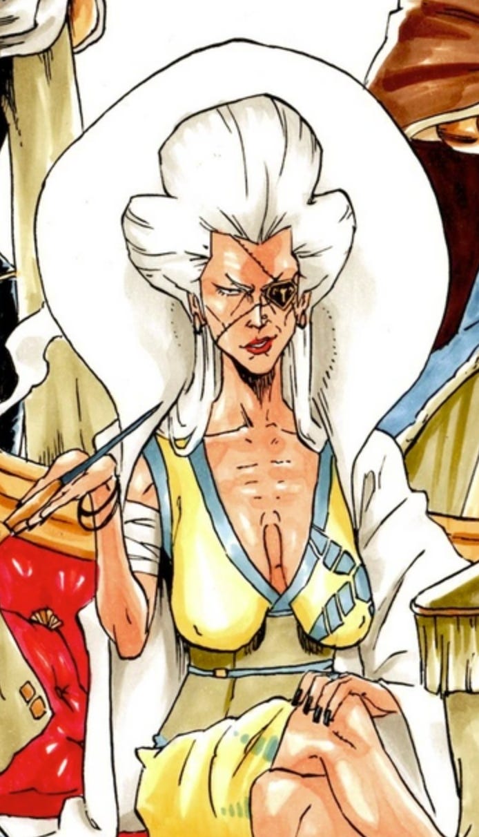
Not many mangaka have the courage and resolve to give their characters big ol floppers, but Whyte did, and she’s constantly showing those off those puppies. The only way this could get better if another chick with even saggier tits sashayed her way into Apple Black. Then the two could flop them all over the page in a battle for dominance.
Now onto the roast.
Chapter 1: The big fist.
The most common composition for the cover of a Saturday AM tankobon: There’s a Main Guy and he’s got a Big Fist, moments away from clobbering the camera. It’s such a simple but effective composition that Apple Black has used it twice on official cover art.
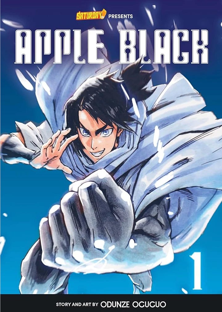
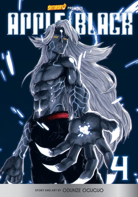
Now I get why this is such a common composition for manga covers. You, the viewer, are put in the moment and part of The Action!!! and it lets everyone know that they’re gonna gear up for adventure. And I know these aren’t the same composition - note that volume 1 the camera’s looking down on Sano and he’s charging up, vs. volume 4’s low angle and extended hand. Viewed together they’re interesting compliments to each other and show an interesting cause/effect.
But I’ll stop saying what they did right and dig into why these covers suck.
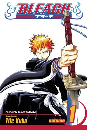
The main thing being that they feel like what you would get if someone was stuck on a deserted island for decades and all they had to read was volume 1 of Bleach. Our stranded hypothetical artist absorbed this, and only this, as the Platonic Ideal of a Manga Cover.
There’s a copic-colored Manga Guy against a blank background, and the selling point is more or less that this is A Manga. It worked for Tite Kubo and got him 74 volumes and a spinoff series about lesbians, so, why the hell not.
And I won’t be too hard on Bleach: even if it’s simple, it reveals a lot about the protagonist and the overall story. Note his more modern jewelry and how it contrasts with his more traditional outfit and weapon. There’s a Big Fist, but it’s not just to charge up a Nondescript Energy Beam - it’s to give the reader a subtle cue into Ichigo’s personal style.
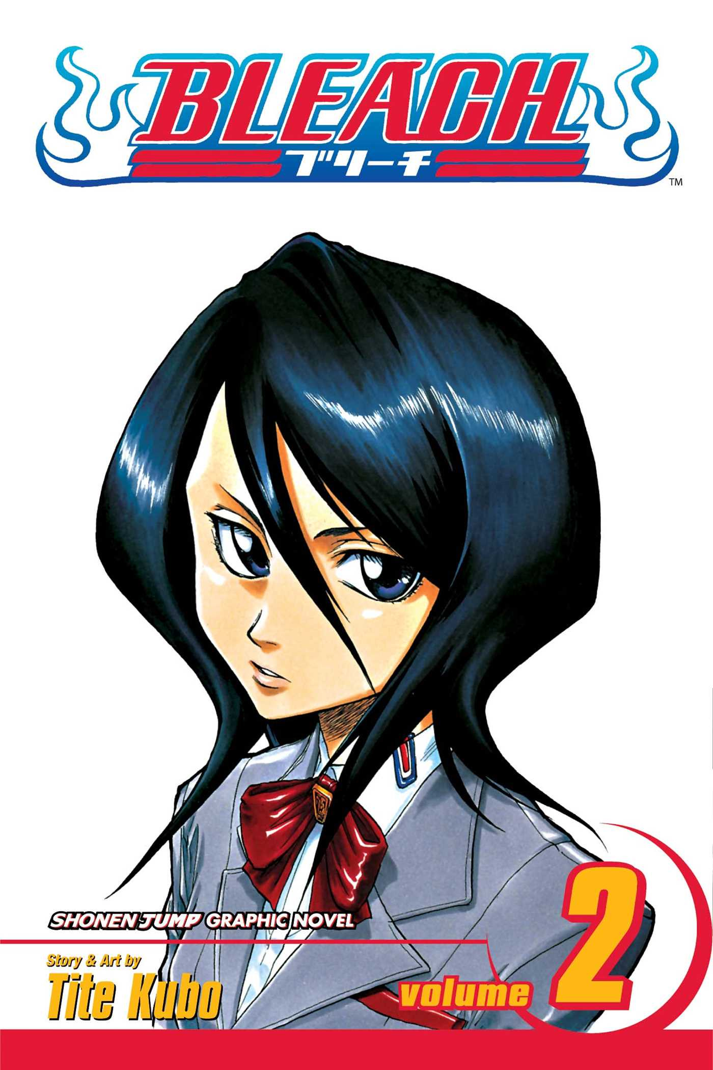
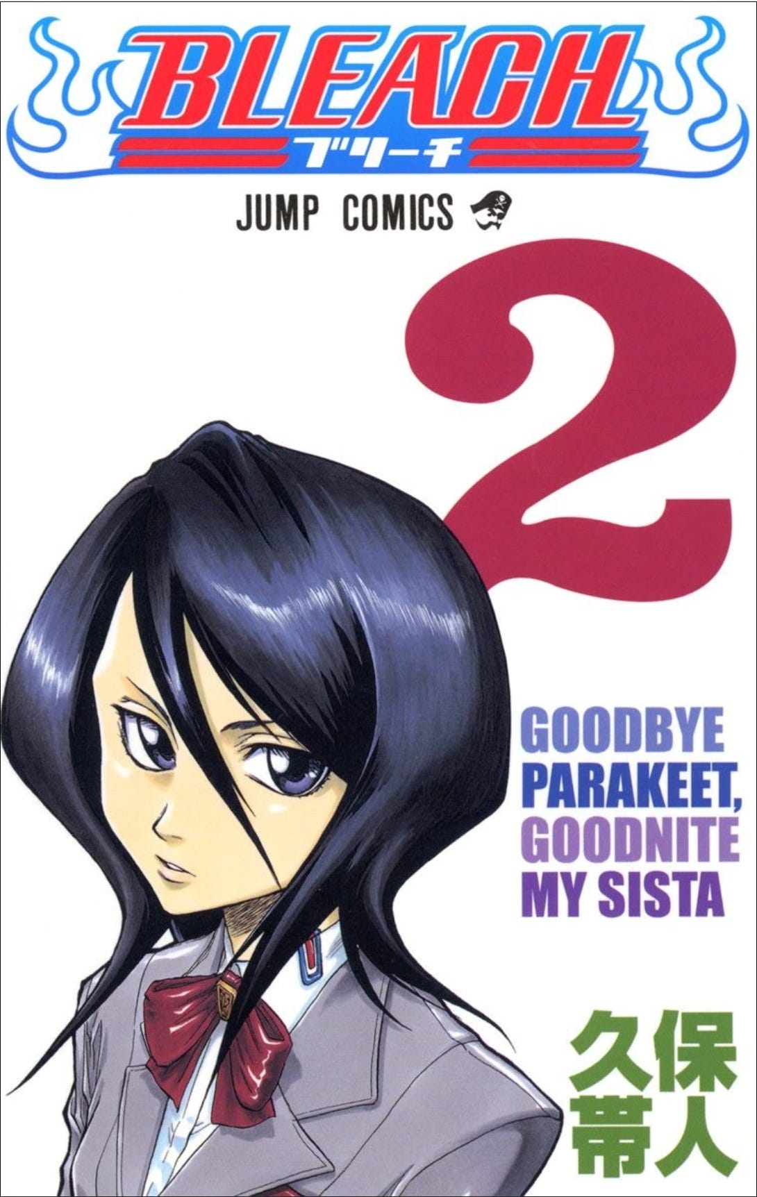
Please also note that I’m comparing Apple Black to the American edition of Bleach. The Japanese edition plays around with text/composition and speaks more strongly to the series rebellious spirit.
I am guessing the American edition was given a more uniform look because it was more important to establish the Shonen Jump brand (Naruto and Yugioh printed in that era have a similar cover formatting), but that’s just a guess.
Anyway, my point is, Bleach is now 20 years old. Slapping a flatly-colored Manga Guy on a cover does not mean shit when this type of book is now no longer exotic; manga is now sold by the bucket at Wal-Mart. And Bleach, the patient 0 of the Big Fist, wasn’t even doing this lackluster design. Just look at how any of the Japanese covers could double as an indie album art - I can only compare Apple Black’s covers to a flattened international edition. Manga is constantly evolving, so it is baffling seeing Apple Black’s throwback of a cover under “New Releases” - especially when I know Whyte can do better (Again, please see my point about him being good at digital coloring).
This speaks to a big bug/feature of OEL: so much of it is stylistically trapped and locked into the past. It is astronomically removed from the constantly evolving aesthetics and tropes of manga made in Japan. Manga in Japan is (generally!) treated as more of a disposable pulp medium. International artists are (generally!) more likely to have only a handful of series psychically imprint and influence them for the rest of their lives. I will be a very clever enlightened centrist and say that there’s goods and bads from both sides - if we can strawman these two extremes as “manga as pulp medium” vs. “manga as a sacred object”.
And with simulpub now the norm, it’ll be interesting to see how this influences the next generation of international manga artists. It’s a topic I definitely want to explore in depth another day. But I will say that Apple Black volume 1’s cover resembles the absolute worst of the “manga as a sacred object” mindset.
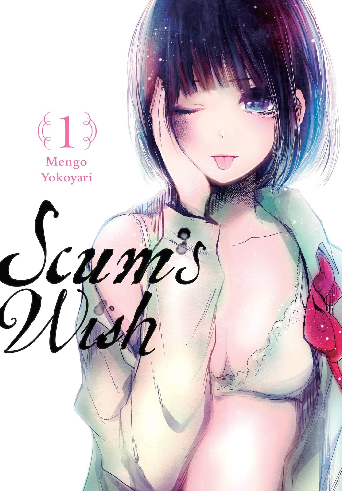
And that’s not saying you can’t do this type of cover, or that simply showing off your characters means you’re a dinosaur. Here’s some manga I impulse-bought based on the cover alone, with compositions that can uncharitably be described as “just some fuckers milling around”:
It’s a small sample, but each of these have infinite more appeal than Sano’s scrunched-up face. There’s something about these that grab me (the opposite coupling of Horimiya, the sexual appeal of Ten Count, the jarring visual conflicts of Scum’s Wish). Just who in the fuck is going to look at Apple Black’s cover and give it a completely blind impulse buy? What are they aesthetically offering that I haven’t seen in the past 20 years???
I went through Amazon’s new releases of manga to try to find more covers with a Big Fist, since that style of composition is the current topic of my rage. Here’s what I found:
This is what volume 1 of Apple Black is up against. Imagine you know absolutely nothing about any of these series. Who’s going to choose Apple Black, unless you can only read left-to-right?
Chapter 2: That time Whyte should’ve used a big fist.
This is the peak of nitpicks since this was drawn back in 2018, but this shit still haunts me to this day.
“The Incredibles in My Hero Academia at U.A” is a drawing made by Whyte Manga. It delivers what it promises. Here’s the Incredibles family reimagined as Kohei Horikoshi characters. And like anything Whyte draws, it sure is technically correct. Everyone looks like a HeroAca character and you can’t dock it any point for being off on perspective/anatomy. Good job on the technical proficiency, I guess. But the composition is all kinds of wrong so it hurts to look at.
So here’s a redlining.
“But Tapirclip,” you say, using my full artist pen name, to help spread my brand recognition, “That drawing’s over 6 years old!” Alright, fine, I’ll break down some more recent drawings of his.
I’ll only use drawings he’s showcased on YouTube or exist for a big promotion. In other words I’m not picking apart little doodles he made during Gartic phone, I want to use times where it’s vital that Whyte flexes and shows off his best work.
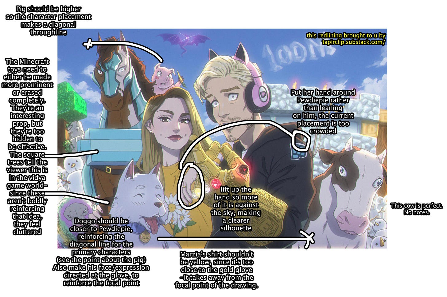
“Pewdiepie Minecraft 100 Million Subscriber Fanart” published September 2019:
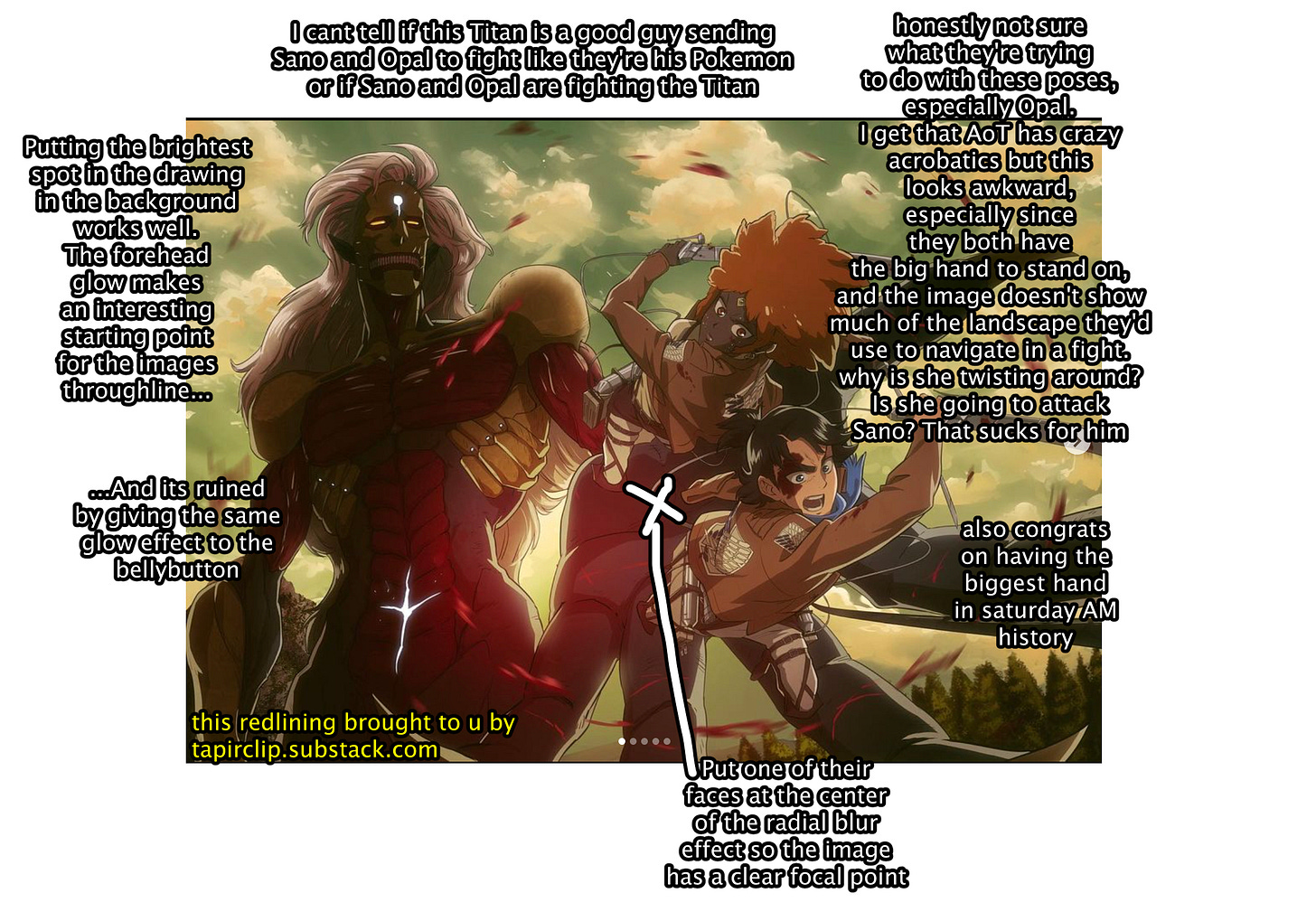
Attack on Titan/Apple Black Crossover, published September 2023
Chainsawman/Apple Black crossover, published September 2023
And then there’s a particular type of composition that Whyte’s used a few times: a character looks off into the distance, while a chick (it’s always a chick) looks directly at the camera.
These images have the same “Disney Princess” problem mentioned in the Chainsaw Man crossover picture. And sure, you can have characters looking in different directions and still have strong composition. Obviously. But these speak more to Whyte’s general issues with his compositions feeling unfocused and shaky.
Now if someone was to say to me “Help, Tapirclip, I thought Whyte was great at composition but your snarky redlines opened my eyes. How can I get better at illustration composition?” (once I amass a Verbalase amount of money to make a porno, this will be the opening line)
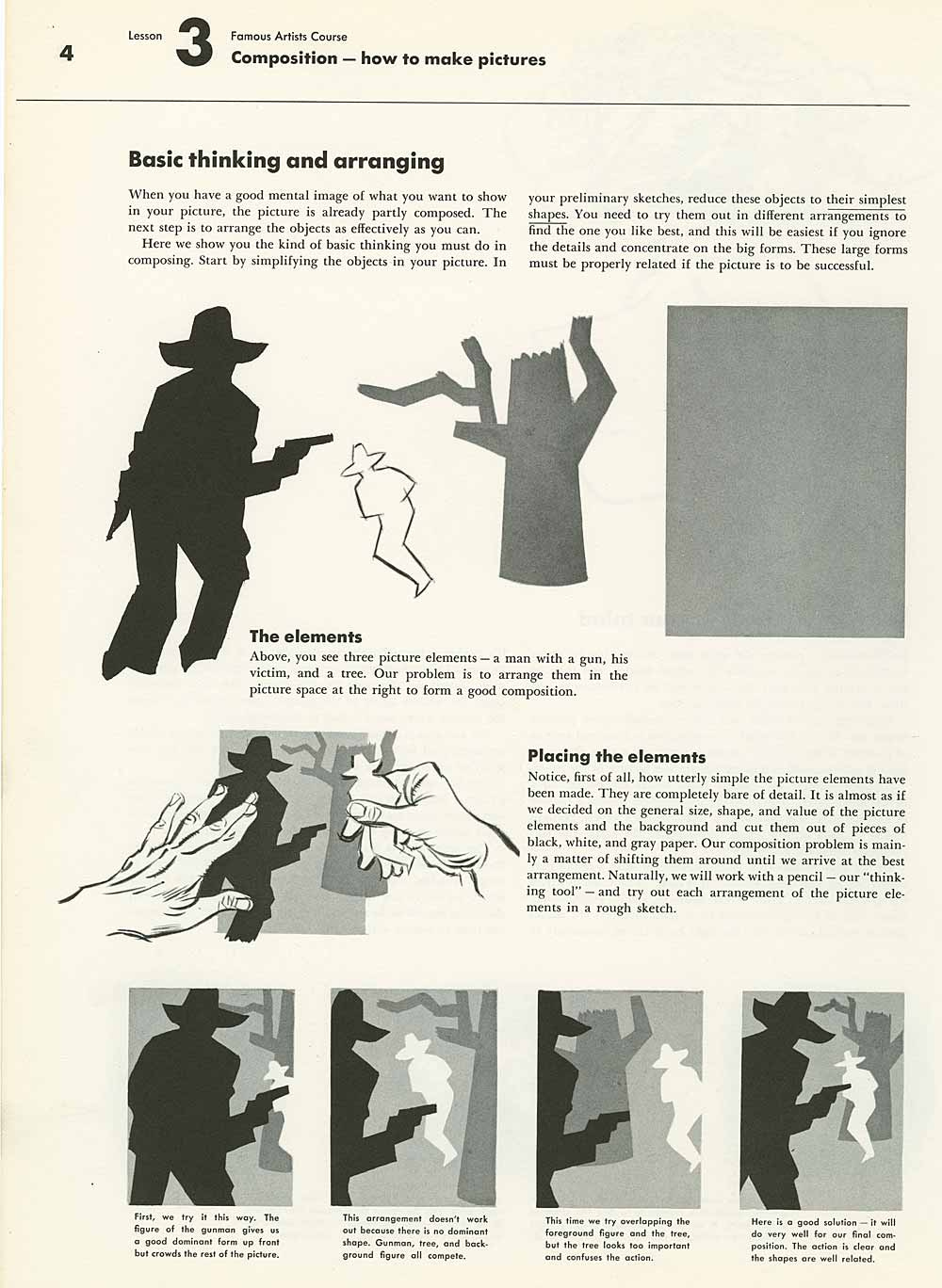
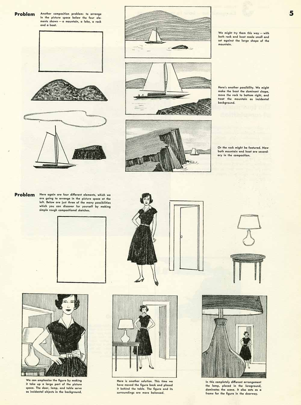
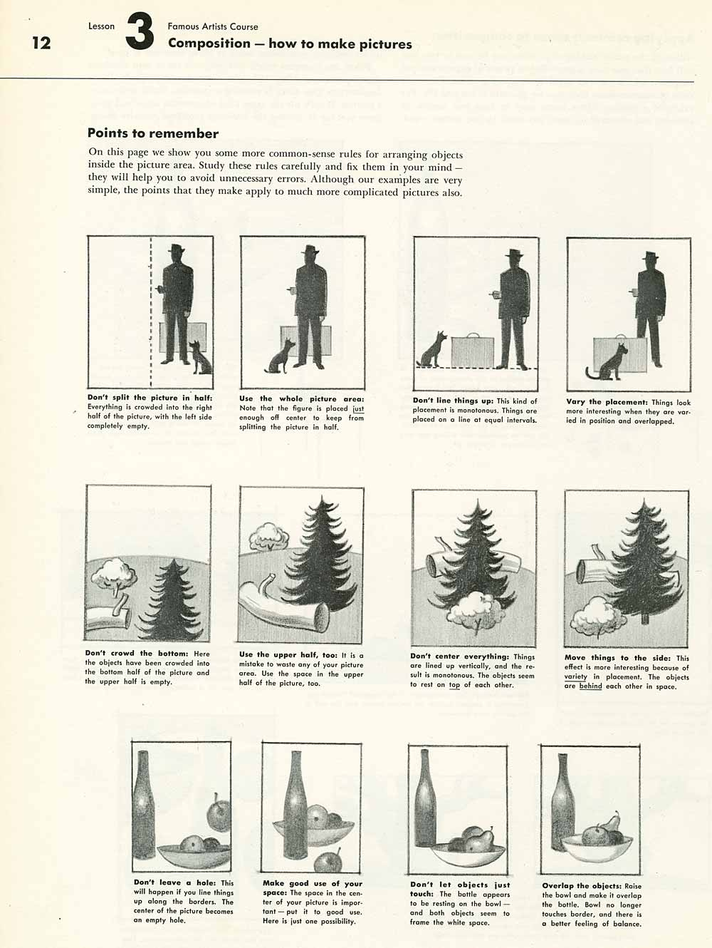
My answer to this hypothetical comment would be a little basic: I’d say start by studying Norman Rockwell. I know Norman Rockwell isn’t really hip these days and about as opposite of action-packed shonen illustrations as you can get. But his paintings tell a complete story in just one panel. He doesn’t have you guessing what’s slightly offscreen that our heroes are fighting/ogling. And when you are guessing - it’s deliberate, to add to the picture’s greater message/composition.
I know you’ve all seen his work so I won’t repeat them here. So instead I’ll share some pages from “Composition: How To Make Pictures”. I lifted these scans from Animation Resources, if you want to read the entire chapter.
And I don’t have a source for this one, but I’ve always like these notes for Spongebob animators:
Chapter 3: Something is wrong with this face
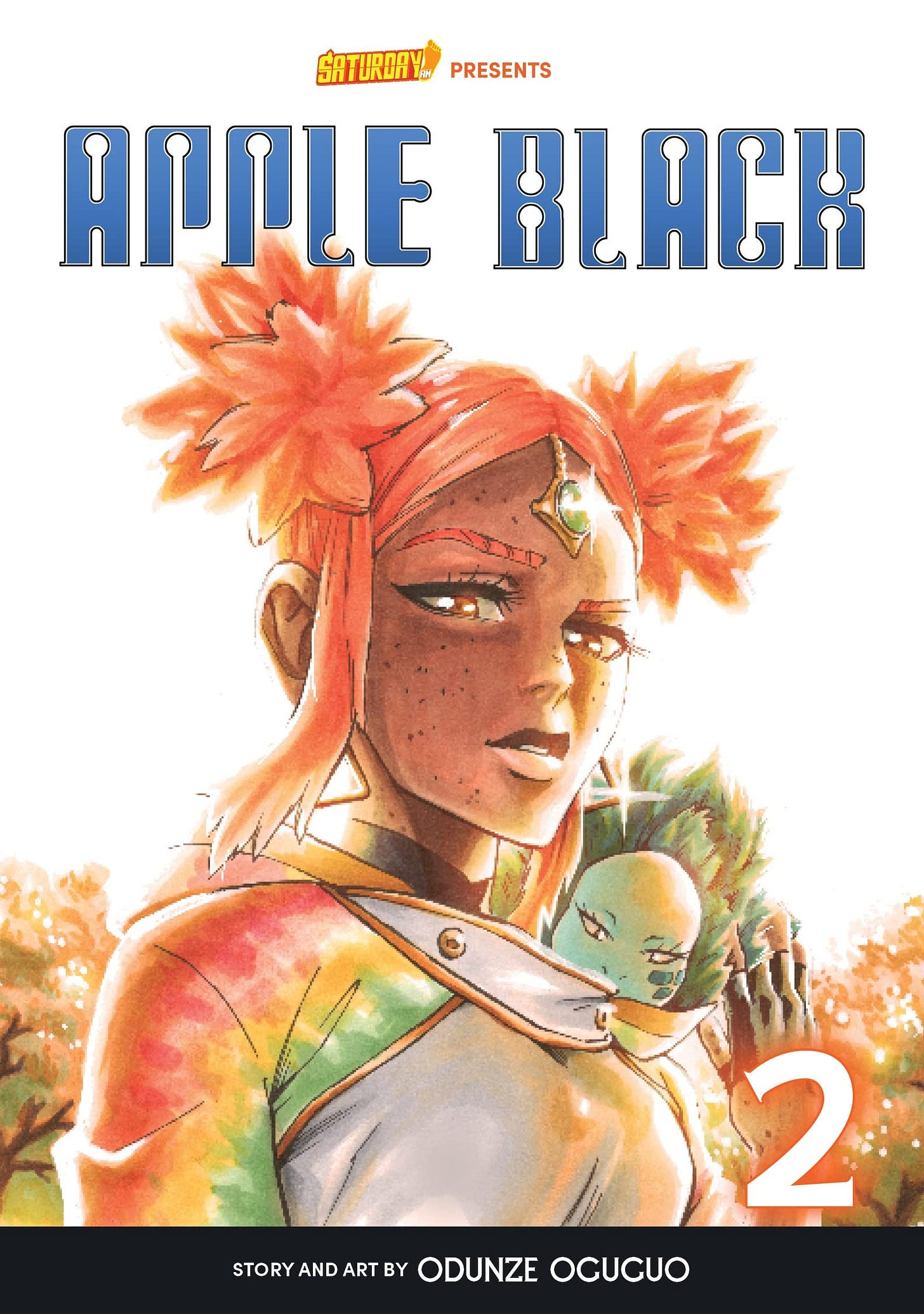
Volume 2 of Apple Black features Opal Wantmore. Back in section 1 I asked “What are they aesthetically offering that I haven’t seen in the past 20 years?” well, Volume 2 offers something different with one of their Black characters on the cover. Neat. Bleach didn’t do that until volume 17, and most manga have a resounding 0 Black characters on their cover art, so, that’s one way Apple Black is advancing the art of manga.
But I’m not really sure what’s, like, her deal. If Sano and Arodih's covers show them using their Nondescript Lazerbeam Hands, then what the fuck is Opal’s power? Looking smugly at the viewer? Fuck you.
Tiny nitpick, but Opal’s hand is weird. I keep thinking it’s backwards. I don’t know if it’s an issue with perspective or the way it’s gestured. Either way, it looks too small. I guess someone in the cast has to have a tiny Barbie doll hand, so the net average hand size on Saturday AM tankobon covers are closer to an average human’s hand size. Thank you for your sacrifice, Tiny Hands Opal.
Anyway, I see she has a Pokemon on her shoulder, so I’m glad Whyte listened to my advice about putting Jack-Jack on Mr. Incredible’s shoulder. But what’s the Pokemon’s power? Looking smugly at the viewer? Fuck you.
Let me pivot to some more generalities. If much of OEL manga is made outside of the standard ecosystem of manga, artists can build a better manga world from the ground up. The biggest issue OEL is conscious of is the general karoshi culture of mangamaking.
Another big one- that’s a little harder to pinpoint- would be that shonen series in OEL are a little more asexual, the standard “anime fanservice” is borderline nonexistent, there’s less appeals to cuteness.
And like, I get why. If you’re making independent shonen manga, odds are you love the Grind, you’re a high-T tough guy, you’re too busy kickin’ ass to sit down for a slice of cake with the K-On girls. Characters being cute isn’t a priority when your story is about the action and you’re enough of a maniac to make a manga completely on your own. And if we’re speaking in the broadest of generalities, an aversion to waifuism is the biggest difference in internationally-made shonen vs. Japanese-produced shonen.
I’ll say it loud and clear: artists can draw whatever they want, if you’re traumatized by decades of anime fanservice horseshit, more power to you for making your art as sexless as possible. I agree with the great philosopher Voltaire’s classic quote on freedom of speech: “I may not agree with your safe-for-work art since I’m a futanari milf artist, but I will defend to the death your right to say it.”
But like, I dunno man. You don’t need to draw outright moeblob faces. I’m just saying that not every character needs to be a Tough Guy Badass. Giving an inch to cuteness can go a long way for audience appeal. Just look at the generational seismic impact we’re still grappling with because Naruto and Sasuke just look so darlin’ next to each other.
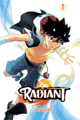
And if you think it’s sexist that I’m bringing this up now, when The Girl is on the cover of the book, well, she’s not really doing anything other than flashing a smarm brow at the camera. Seeing this makes me all too aware of how every Apple Black character has a face that is entirely devoid of pleasantness. Let me compare with volume 1 of everyone’s favorite franime, Radiant:
Seth has a similar tough-guy expression, but he looks so much more inviting than Opal or even Sano on volume 1. The difference being his eyes. There’s a sleekness to the eyelids and eyebrows. The unnecessary detailed and sharp eyelids/eyebrows give Opal an unnecessary heaviness to her face. Maybe if her eyelashes were drawn with a lighter pen weight it would resolve some of this issue, but they’re still structurally off.
Seth’s eyes are bigger/rounder/cuter, without ever veering into the territory of being too feminine or western-styled. And the actual pupil is relatively simple for a manga character - so that’s how you know he is not cute, he’s a man of action.
There’s nothing particularly feminine/waifu/moe about Seth’s design. Seth is a Standard Shonen Hero. He really is just the tiniest smidge into ‘cute’ on the cute/badass character designer slider. And his manga got an anime adaptation, so, maybe Tony Valente’s onto something here.
This is what I mean when I say you don’t have to draw outright moeblob faces. Just give them the tiniest pinch of sweetness. Please. I am begging you. Please.
Chapter 4: The Bakugo Cover
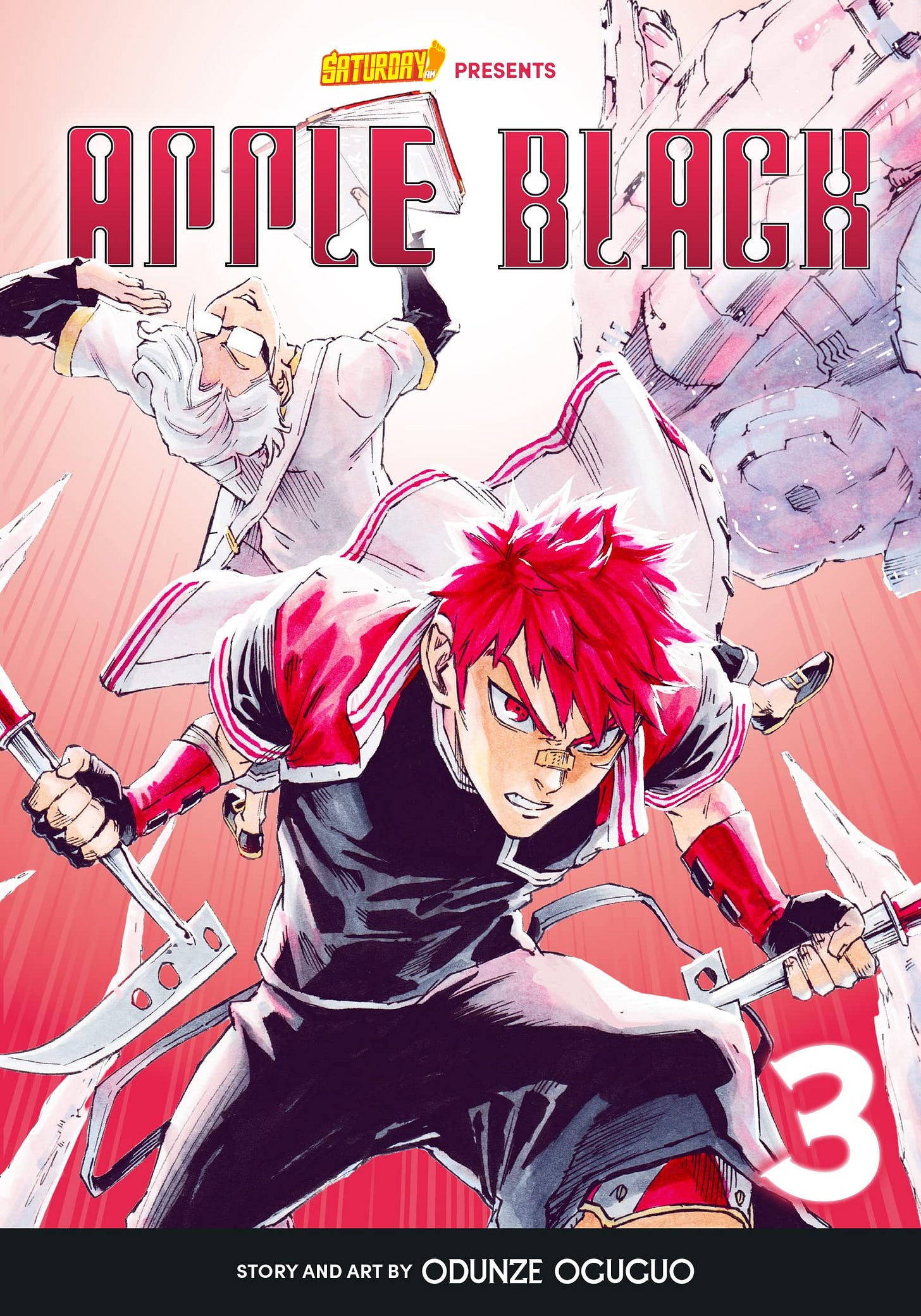
Volume 3 of Apple Black features Bakugo Katsuki and a young Hatake Kakashi, ready to slap ass and read books and they’re all out of slap. And I gotta say. This is easily my favorite cover of what’s out so far. We have a clear, dynamic pose, interesting staging, we see the character’s personalities expressed in a unique way, colors are crisp but interesting (the subtle bits of purple go a long way). Most importantly, these two dudes look cool as shit. Remember those batch of random books I picked from the “New in manga” I posted in part 1? This cover would easily stand out in that group.
I don’t have a lot of critiques for this one, but I do have them so I’ll say it. I’m not really sure what’s going on with the spaceship to the right. It adds unnecessary clutter and makes the composition visually uneven. Erase that and you’ve got an honest-to-God example of a strong composition in manga art. I’m really so, so happy that my critique in chapter 2 paid off (If Whyte listens to my advice 3 times that means we are now legally best friends).
I also wish that the title wasn’t partially obscuring Kakashi’s book. The focal point of the image is Bakugo’s face, so having Kakashi’s book at the top makes an interesting start of the composition’s through line. But that effect is kind of ruined with a logo slapped over it. Which is kinda frivolrous, maybe Whyte didn’t know about this when he drew it. In other words, I forgive you, senpai. This is the sort of thing you can fix when you rerelease for the 10th anniversary edition.
Also on Whyte’s instagram, he posted the unedited version of this drawing. Check it out:
We’ve evolved from the Big Fist to the Big Foot. This really is making new strides.
Chapter 5: You Were So Close
The most recent Apple Black tankobon cover is pretty good!
We have a clear focus, we’re seeing the character’s personality, there’s a specific fighting mechanism, we’re right in The Action. There’s a cleanliness and confidence to this coloring that’s a real step up from the previous covers. The digital effects add the perfect touch of sparkle. And all of my previous complaints about the characters being placed in awkward spots against the background are gone! The viewer is supposed to look at Sano’s face, and there it is, standing out against a blue background and further reinforced by the rock formation. It is expertly done…
…And Opal throws the whole composition off.
This was so close to being good. So Close!!! But making Opal leapfrog over Sano makes this composition visually topheavy and unbalanced. Sano’s face is the focal point of the illustration. But Opal’s face is even bigger/closer, so it draws away from everything this illustration is building to. It’s sending mixed messages, ya feel.
So if Opal was erased, this would have decent composition.
But they can’t do that.
If you go on Apple Black’s amazon page, they end their summary with telling you who Opal is, so you know that when she’s not on screen you’re supposed to ask “Where’s Opal?”

Anyway, if you absolutely cannot erase Opal and there’s not enough time for a redraw, here’s what I’d do to make this look a little better.
Chapter 6: Exactly what is my fuckin damage?
The worst- absolute worst- kind of commentator on Deviantart and FurAffinity are guys who give unwarranted critiques on art. Please note that I said “unwarranted” - I know what I’m getting into when I send my manga to an editor or a Discord specifically for art critique.
Usually when I’ve received these comments they’re focused on the anatomy, because let’s be real, my anatomy is absolutely rank. And when I hear these critiques I kick my feet up on my detention desk, like I’m a Gen-X rebel of yore, and counter with: good job genius, you pointed out an obvious flaw. Can you tell me fucking anything else about this drawing? How would you improve the composition? The placement of shadows? The outfits? Fixation on anatomy gets in the way of thinking deeper about art.
I’ve heard artists say that e621 is the best website to upload for feedback, because hooo boy, furries do not want to look at ugly porn. Draw all the hyper cock vore you want, but you better make goddamn sure the elbows are in the right place. There are countless commenters on that website that will tell you exactly what and how you drew anatomically incorrect. And these oh-so-astute commentators can make the rounds, confident that they’re improving the World of Art by letting artists know exactly where they fucked up. It’s a low risk/reward for commenters: anatomy is one of the more “objective” measurements in art, and you get to look like the Internet’s cleverest critic for pointing out these flaws.
By critiquing Whyt’s art I have become another version of what I hate the most. And I know I’m not reviewing his work in good faith.
If Whyte sucks at drawing I could just, like, walk away and not look at it. It really is that easy. There’s plenty of manga I don’t care about, but they rarely eat up as much mental processing power as Apple Black. But here I am, having just spent the last 30+ minutes railing against this ugly art.
My lashing out as Whyte’s art is more or less misplaced anger, boiling up from years of people telling me my art sucks.
Yesterday I finally uploaded chapter 1 of my manga “Dream Root” in its entirety in English. I got one guy on FurAffinity who DM’d me saying he liked it (Seriously, you the real MVP) but the other online comments are more or less saying it sucks. And that is, sadly, part of the deal when you share things online, but this ain’t my first rodeo.
The mean comments on my manga AniApt sent me to such depths of zetsubou- but after that gauntlet of hurt I re-emerged feeling generally less bothered by Internet Stinkers. But I won’t act like I’m totally above it all. Looking at the one-star ratings for Dream Root makes me wonder why I went through the effort of sharing this in English. Especially since this is the series I would dedicate 100% of my time to if I had 6 months to live (don’t worry, I’m fine, just speaking in hypotheticals).
I thought this would stand out as my magnum opus that everyone would love and clap and cheer and want to see more of, and when I posted it I would finally have a series that people are eager for me to make more. Instead, it’s currently rated the lowest of anything I’ve uploaded to Mangadex. That hurts. It hurts being so wrong about something you put your heart into - but again, that’s part of the creative process, part of the Internet, part of life.
And then I tab over to Whyte’s art. To my beady little tapir eyes, it’s overflowing with errors, yet everyone loves it. He gets way less haters than me, even without adjusting for scale. I’m honestly jealous of his success, his career, all the love he gets. I’m not gonna pretend I’m above feeling jealous.
Whyte is crowned royalty in the world of OEL manga. Just look at the difference in how we draw ourselves. It’s obvious who’s the take-no-shit shonen protagonist and who’s the dopey background character.
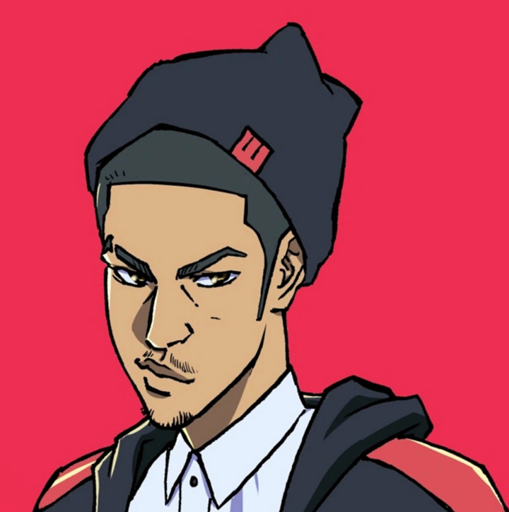

At best, I could fill the role of the Forgotten Rival. I’d show up as an anime-only filler character in the tournament arc and boast about how I spent my entire life training to defeat our protagonist, Whyte. I’d even throw in how he unknowingly saved me. “You don’t understand, your video about AI art changed my life!” Or “It meant so much when you favorited my homoerotic drawing of Arodhis!”
To which he’d blankly stare and ask, “uh… who are you?”
The friendfiction writes itself. And I doubt it’ll ever go beyond friendfiction after writing this. He has every right to block me after all the bromance jokes I made in this post, and the explicit cocksucking jokes I made in Discord. Sigh. But I do sincerely see him as a rival and a goal to defeat, even if I am but the smallest of potatoes compared to him.
Now I am going to say something that’s kind of embarrassing, so promise you won’t laugh. But when PolyMonFur was approved for serialization, I made it my goal to get an anime before Apple Black. Which is just, fucking absurd. Saturday AM is making all kinds of industry connections lately, it won’t be long until Apple Black is sold at Scholastic Book Fairs next to Dog Man and absolutely dominating America’s manga market. My goal is flat-out not going to happen, unless I can weasel-words the finish line to “Get an anime in less time than Apple Black.”
Although Apple Black’s tankobon releases are relatively new, Apple Black as a serialized webcomic is over 10 years old at this point. In which case, getting an anime in under a decade feels completely feasible. So I have that backup goal if I fail my first deadline. But either way: it is psychotic to make my goal ‘get an anime before this specific artist.’ Like, grow up, dude.
And yet…
If WhyteManga is my parasocial art-rival because what we value in art is diametrically opposed, then this is another philosophy where we’re mirror images of each other. Because the truth is, I cannot imagine spending more than 10 years on anything, ever, and I hope the chicks I’ve been texting will read what I just wrote and take the goddamn hint. But here’s Whyte, puttering along on his manga for over a decade now, with absolutely zero plans of stopping. Apple Black is planned to be a robust 20+ volumes (sorry, I can’t remember the exact number, I know he said it somewhere in a youtube video that it’ll be a longboi). Even if he picks up the pace and doubles his speed, this series could easily take him the rest of his life to complete. And that’s scary, in an existential way. In 10 years, where do I want to be? What do I want to have accomplished? I just hope whatever I’m doing in a decade is different from what I’m doing now. If I put my mind to it I can have Dream Root done in 6 months.
And yet, I clearly haven’t. I’m always distracted by new things, I’m constantly experimenting, even living in the same place for more than a year makes me outright antsy. If Whyt’s big flaw is taking too long to finish his manga, then mine is being too in love with novelty to sit down and commit myself to anything. And if I’m fliffing through life and not committing to anything, what reason does anyone have to give me their blessing: financially or emotionally? I could learn a thing or two from Whyte’s commitment mindset, but also, being locked in like that scares me. It honestly scares me.
Coda: So, now what?
Someday I want to review Apple Black, which will happen once I get a copy of Apple Black. And the odds of that are not zero, since it happened before. Once upon a time I checked out all of the Saturday AM tankobons from a library. They had the whole slew of Diverse Manga Heroes in the Cool Books section.
And of all the Saturday AM tankobons, Apple Black was the one I dropped the fastest. Which means if I’m going to do a more thorough review, I’ll have to push past that initial gag reflex and make more of an effort to finish my meal.
Hopefully in this post I’ve made clear my bigger issues with Whyte’s art, as well as my bizarro emotional hangups, so in the future we can charge right into an Apple Black review without getting too distracted.
Thank you for reading. This post is a little longer than normal, so it would mean all the more if you took the time to share it.
Copyright Disclaimer: Under Section 107 of the Copyright Act 1976, allowance is made for "fair use" for purposes such as criticism, comment, news reporting, teaching, scholarship, and research. Fair use is a use permitted by copyright statute that might otherwise be infringing. Non-profit, educational or personal use tips the balance in favor of fair use. I’m not trying to be an art theif, just a critic. Pls no bulli.

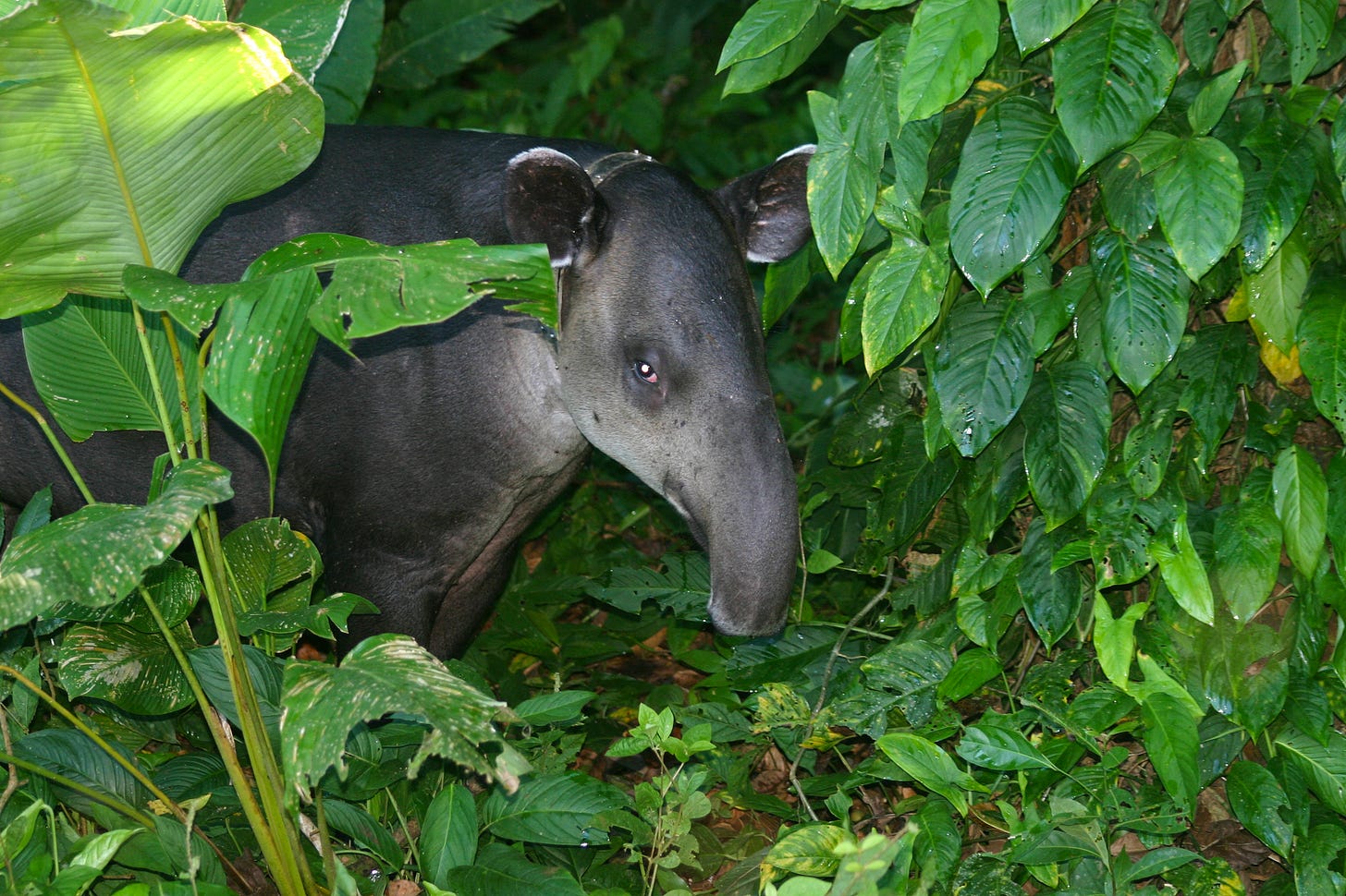
Tapir photo credited to Brian Gratwicke, Flickr, CC by 2.0.

WhytManga's art taken from his Instagram (https://www.instagram.com/whytmanga) and Deviantart (https://www.deviantart.com/whytmanga)

Composition: How To Make Pictures taken from
https://animationresources.org/instruction-composition-how-to-make-pictures/
My manga “Dream Root” is now on Mangadex
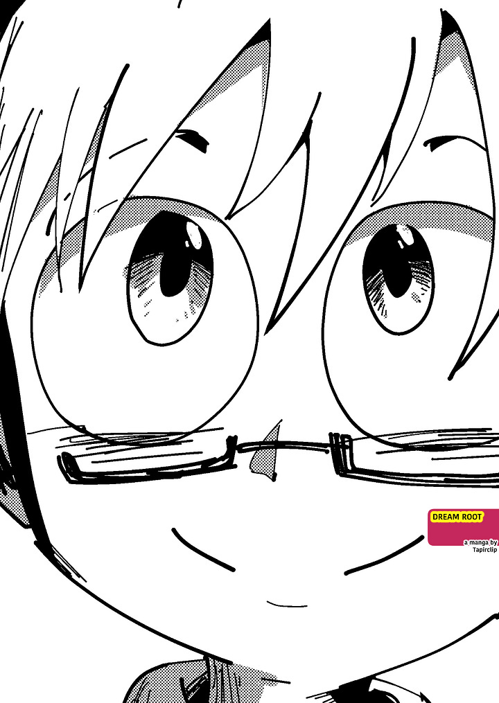

If you love Apple Black, you can help its success with a 5-star reviews on Goodreads and by preordering volume 5
Thank you for reading!



















You are actually retarded
Wow I..didn't notice the composition issues until you pointed them out. The art looks great anatomically and color wise, but you're right, it feels to "safe"
I also have composition issues so, I'll be sure to try and improve in that department.