If Beastars had more asskicking, you'd get Penguin Boy
There's a new furry manga in town

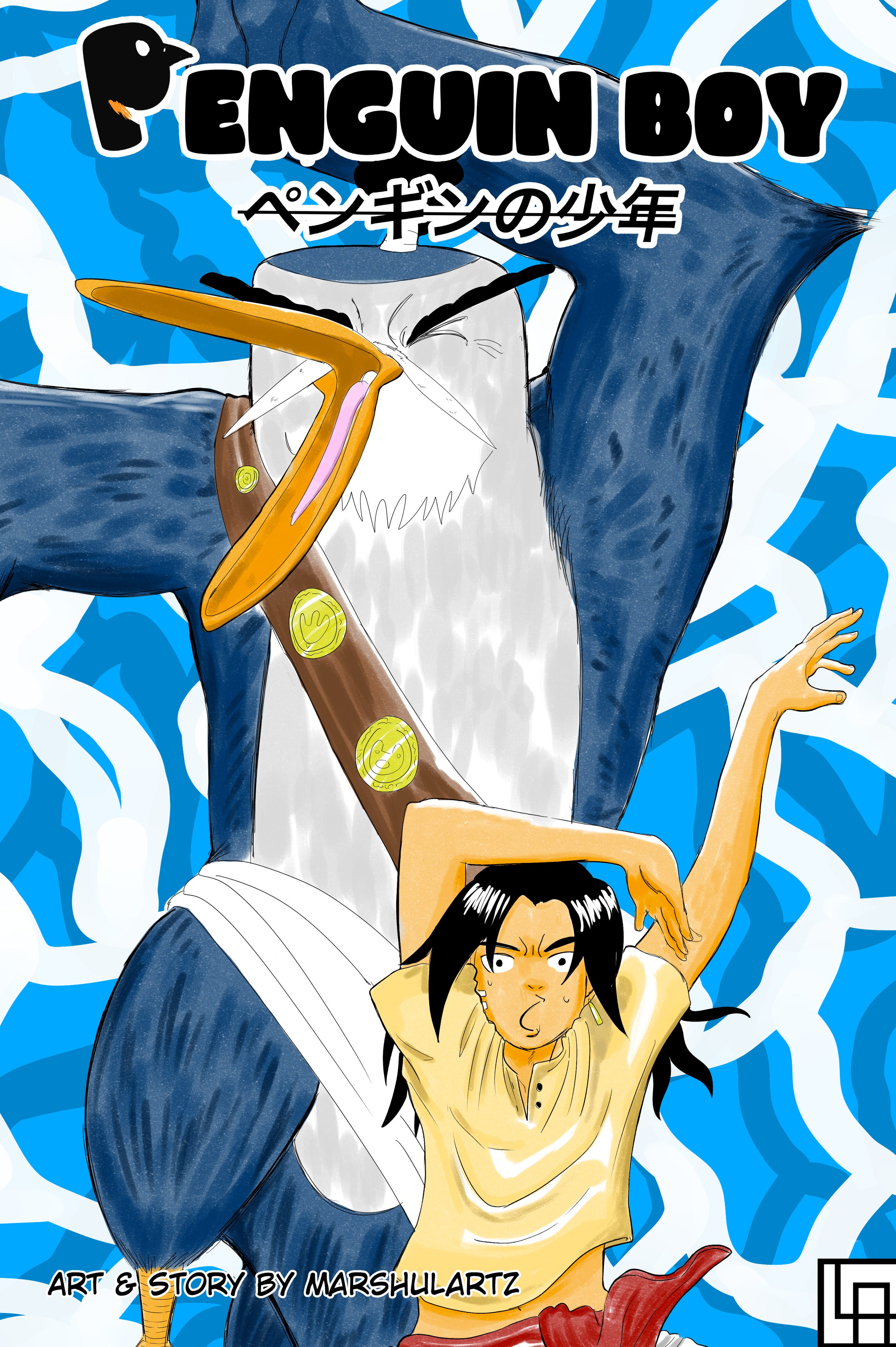
Today I’m reviewing the first chapter of Penguin Boy by Marshulartz, the newest manga on LumeBento. You can read it here and for free.
Summary:
In the land of Edifier, Alba, a young boy with a penguin as a grandfather, embarks on a transformative journey of self-discovery and adventure. Guided by his grandfather's teachings in the art of combat, Alba begins his quest by utilizing his skills to defend and assert himself among the inhabitants of his home island.
First things first: Yes, this is a furry manga.
This manga has Furries, which immediately puts it above manga without furries. Check out this stunning crowd shot:
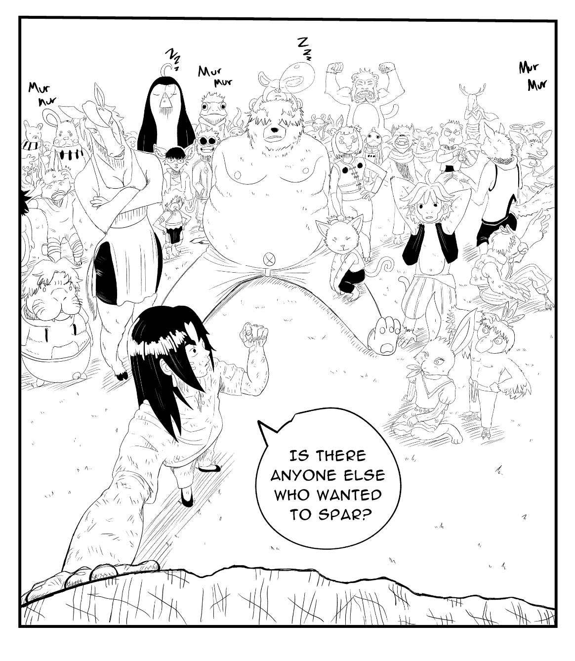
Furry characters help keep everyone visually distinct, unique, and shows off their personality a little more vibrantly than human characters.
But that could be said about any series with furries, so I’ll be real here.
Marshulartz isn’t a puritanical, sexphobic weirdo. Meaning, he’s not afraid to make some of the women curvy- but this is still 100% shonen, and nothing fanservicey happens. It really is just a tiny detail, that I was quick to pick up on because I’ve been so personally hurt and damaged by the pervasive neutering of Mainstream Western Media and the trickle-down effect this has had on small-scale American artists. I was cheering for the beauty of the First Amendment when I saw the tiniest sliver of cleavage on that horse chick in the background. Character designs that move me to tears are automatically a 10/10.
Mailing Unit 23 shows off MarshulArtz’s design philosophy the best:

Everyone here has that perfect balance of being really cool and really cartoony.
Although, I was a bit confused about who’s Vesper, Links, and Ishi. But more about the typesetting later.
Thesis: This manga kicks ass
So far only one chapter is out- and that chapter stands at a whopping 121 pages. Half a tankobon. It’s a fitting start for a deeply ambitious manga. And that’s the ultimate deciding factor for if you’ll enjoy Penguin Boy. Do you want a manga that’s a bit rough and unpolished, but deep in ambitious? Then this manga is perfect. You will have a great time.
If this was broken into shorter chapters, this would be easier to consume and understand. But I dunno. I can’t critique it too hard for what feels like a feature, not a bug. It’s a manga with explosive energy and experimentation, so I could honestly just imagine this was the result of Marshulartz being so enthused to draw manga that he just kept adding shit. Which is cool. That’s the high energy joy I want to see in art.
There’s a lot of shots that are- by all technical definitions- wrong. A bit janky. Take this panel, for example:

The longer I look at it the more I feel it breaking apart. But I wasn’t thinking of the technicality of point perspective while I was reading and absorbed in the moment- it stood out as a solid shot with dynamic framing. Actually, here, let me show you the surrounding scene (Reads right-to-left):
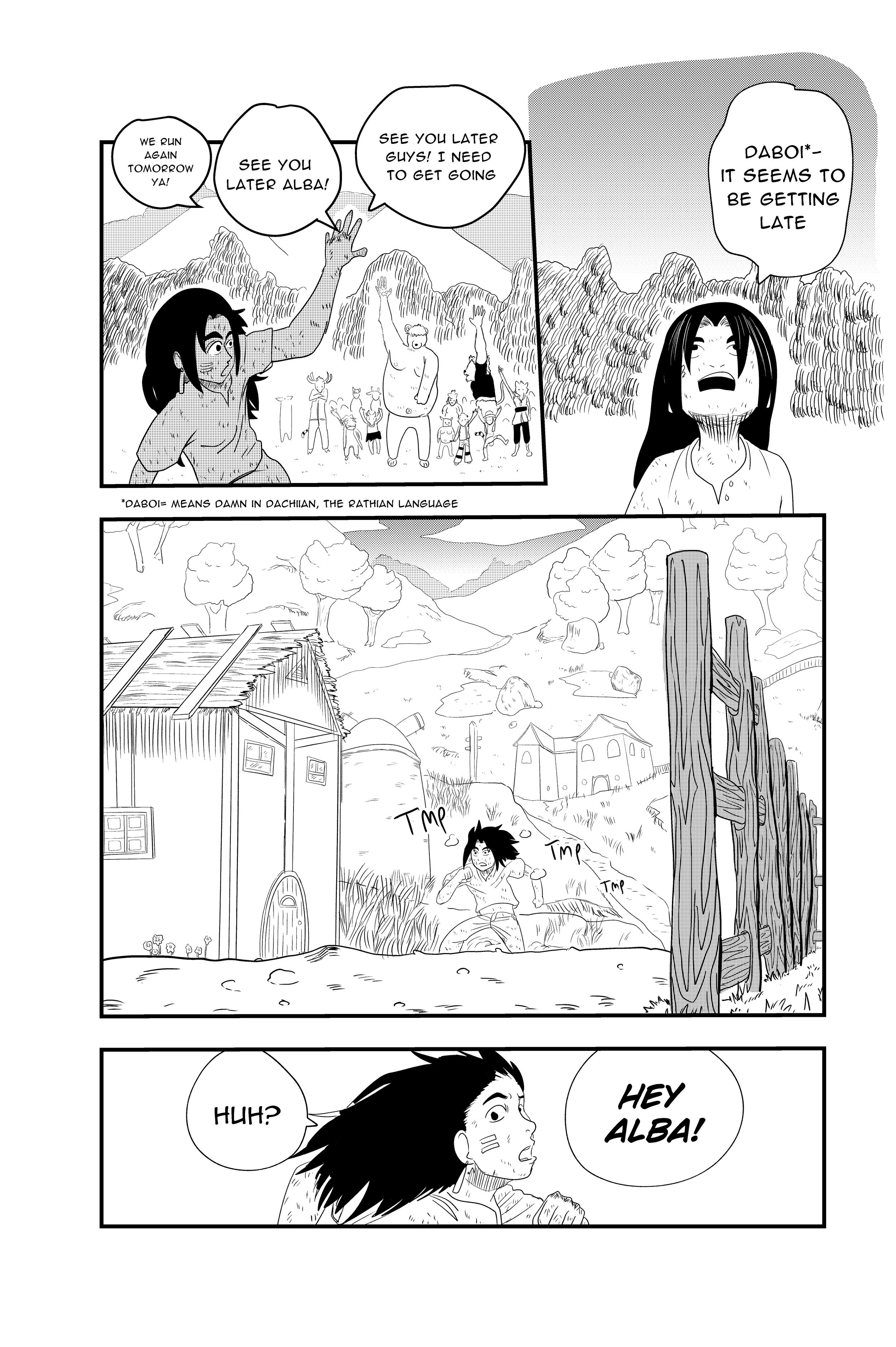


There’s always something new happening on each page. It’s the sort of high energy but deliberate pacing and camerawork that reminds me of Dr. Stone or One Piece, without ever feeling derivative. This reads as the work of someone who is deeply conscious of the art of manga, who is expressing their vision with an expert-level knowledge of this art form.
So I feel a little conflicted wondering how this manga could be improved. Everything seems to be done by hand, for better or worse. Take this shot:

The hatching to imply leaves/greenery doesn’t particularly add anything, and might look a bit more polished if it was rendered with a leaf brush. Here’s a 10-second example done in Clipstudio so you know what I’m talking about:

You know, things like that.
But this sort of thing is deeply subjective, and plenty of artists will say that these shortcuts can outright ruin a manga. Maybe that’s just not the look the mangaka wanted, and it’s easier to form a more consistent visual language if you just stick to doing it all yourself. It might be too much of an eyesore to, say, use 3D Default Village Fantasy House in the background, but hand-render a more specific building later.
And since my own art is an awkward mishmash of assets, maybe this is just my inner crab-in-a-bucket talking. And would you tell the mangaka One to start using 3D to clean up his work? Fuck no, never, the magic would be destroyed if he did that.
What’s more is the shot in question is still visually solid. Let’s take a closer look:

Alba in the foreground stands out with the screentone, looking at his furry friends in the distance. The windmill makes a subtle but interesting division between the groups (who Alba will eventually join, so this staging works as very subtle foreshadowing). In addition to the windmills we have smaller buildings in the distance dotting the landscape to give a greater sense of depth.
So in that utilitarian sense, this art style accomplishes what it sets out to do- there’s really no ‘need’ to give it that extra shine. It has the frantic energy of an intense storyboard, so adding these hypothetical extra visual elements might weigh it down.
Tiny notes about typesetting
One thing that could level up this work is a greater attention to detail to the text. It’s good in the sense that everything is visible, readable, and the sound effects are dynamic and varied. But there’s little things like this page that make it feel flatly amateur. Here’s an example:

The speech bubbles are slightly uneven and, man, that “Alba D Island Boy” character info box feels visually cheap. I’m not particularly well-versed in typesetting, so I’m not sure how to correct this. I just know it feels wrong.
So if any extra hands are added to this pot (as far as I know, this was made without any editors or assistants) I would say get someone else to fine-tune the lettering before it’s published. This wouldn’t sacrifice the artistic integrity or personal style, but a lettering upgrade would make this feel a notch more professional.
And yet, it does a lot right! Please don’t take my pointing out janky text boxes as a complete dismissal of the way this manga uses words. Like I said, the dialogue is easy-to-read and the SFX are nuanced and dynamic. This is especially important with all of the fight scenes. You’re never slowed down by a Talk no Jutsu in this manga, everything keeps flying by, and any dialogue coexists perfectly with the art. You very rarely get more than one sentence in a dialogue balloon, which adds to how quick and easy this is to read (The biggest thing that will make me throw a manga directly in the trash is when you frontload the readers with The Lore).
Little typsetting details (and anatomy, and detail rendering) are minor fixes that will improve with time. The fact that this manga figured out such dynamic, fast pacing puts it above 99% of other OEL you could read.
Oh yeah, about the plot.
I forgot to mention the plot.
It’s a totally fine, completely acceptable shonen storyline. So far nothing crazy has happened - this is something I’m reading for the moment-to-moment visual experience.
Maybe someone who grew up watching Dragonball (in other words, roughly 80% of all manga fans and 100% of Mexico) would “get” the plot a little more and vibe with it harder. I’m sorry I keep saying it- but I’m not religiously into shonen the same way most OEL guys are.
There’s plenty of experimental manga where hesitant readers will push through and stick around for the unique storyline. Unfortunately… I can’t see this happening with Penguin Boy.
In other words, if you thought this was ugly from panels I posted, I can’t see you getting anything out of this.
But I won’t dismiss it completely. Just think of how many shonen manga don’t totally find their footing until a few volumes in. It has the potential to evolve into something bigger, but right now the plot is just sort of a white noise for a deeply unique, visual manga.
I will still encourage anyone on the fence to give it a try, because I have a good feeling about this manga. I will definitely be sticking around for future chapters.
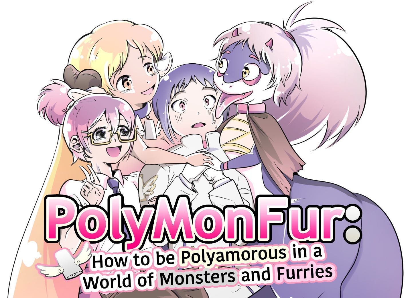
Copyright Disclaimer: Under Section 107 of the Copyright Act 1976, allowance is made for "fair use" for purposes such as criticism, comment, news reporting, teaching, scholarship, and research. Fair use is a use permitted by copyright statute that might otherwise be infringing. Non-profit, educational or personal use tips the balance in favor of fair use. I’m not trying to be an art theif, just a critic. Pls no bulli.“PolyMonFur: How to be Polyamorous in a World of Monsters and Furries” is my serialized ecchi light novel. Read it on Lumebento today (it's free!)
Thank you for reading!